Creating a remote monitoring platform that helps patients understand their data and clinics prioritize care

Overview
I designed a health monitoring platform for adults managing cardiovascular conditions like hypertension and heart disease. The app pulls data from wearables and connected devices, then translates that information into something actually useful, insights people can understand and act on instead of just numbers on a screen.
My Role
Senior Product Designer
Timeline
10 Months
The Challenge
Understanding Data vs. Taking Action
Most health apps treat monitoring like a checklist. They show you your heart rate or blood pressure, maybe add a green checkmark if it's "normal," and that's it. But for someone managing a chronic condition, that's not enough. What does 128/82 mean in the context of your stress levels today? Should you call your doctor about that spike, or is it fine to just keep an eye on it?
Clinic side problem
The pilot clinics the client had partnered with were dealing with another problem too, unnecessary clinic visits. Patients weren't sure when their symptoms actually needed medical attention, so they'd either ignore concerning changes or show up for appointments that didn't require in-person care. The clinics needed a way to triage patients remotely, focusing attention on people who actually needed immediate help while giving others the confidence to monitor at home.
The goal was to build something that worked more like a health partner than a data dashboard. The app needed to adapt to how people were feeling, explain what the numbers meant, and help them figure out when to take action versus when to relax. And it had to do this in a way that reduced the burden on both patients and clinical staff at the pilot sites.

Design Approach
Making Health Monitoring Feel Personal
Most health apps treat monitoring like a checklist. They show you your heart rate or blood pressure, maybe add a green checkmark if it's "normal," and that's it. But for someone managing a chronic condition, that's not enough. What does 128/82 mean in the context of your stress levels today? Should you call your doctor about that spike, or is it fine to just keep an eye on it?
Adding Context to Every Data Point
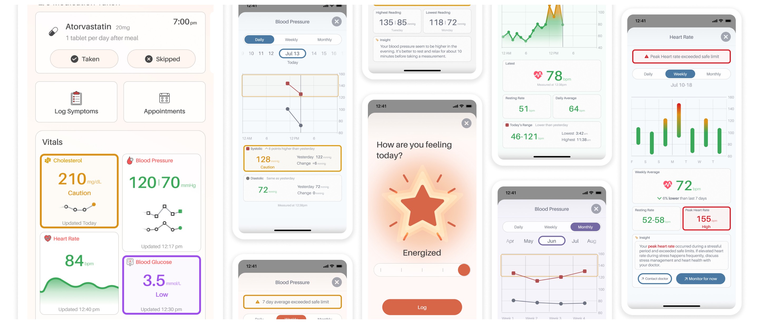
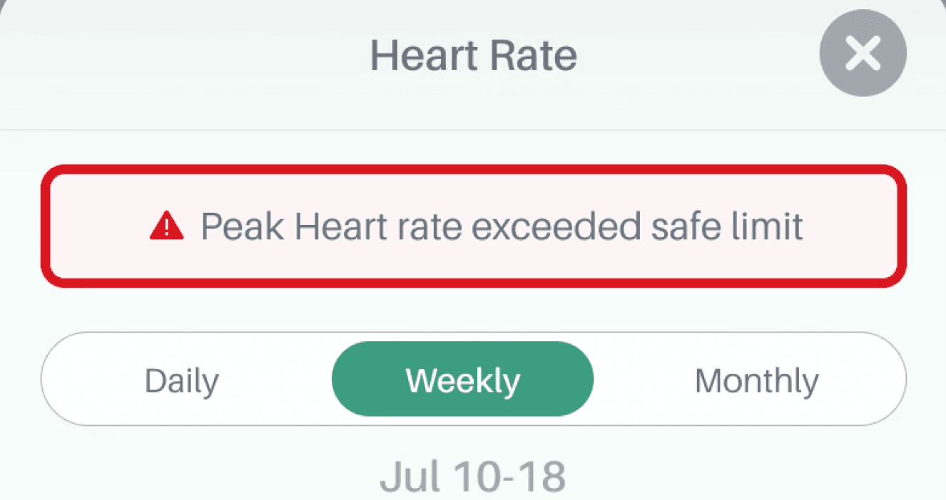
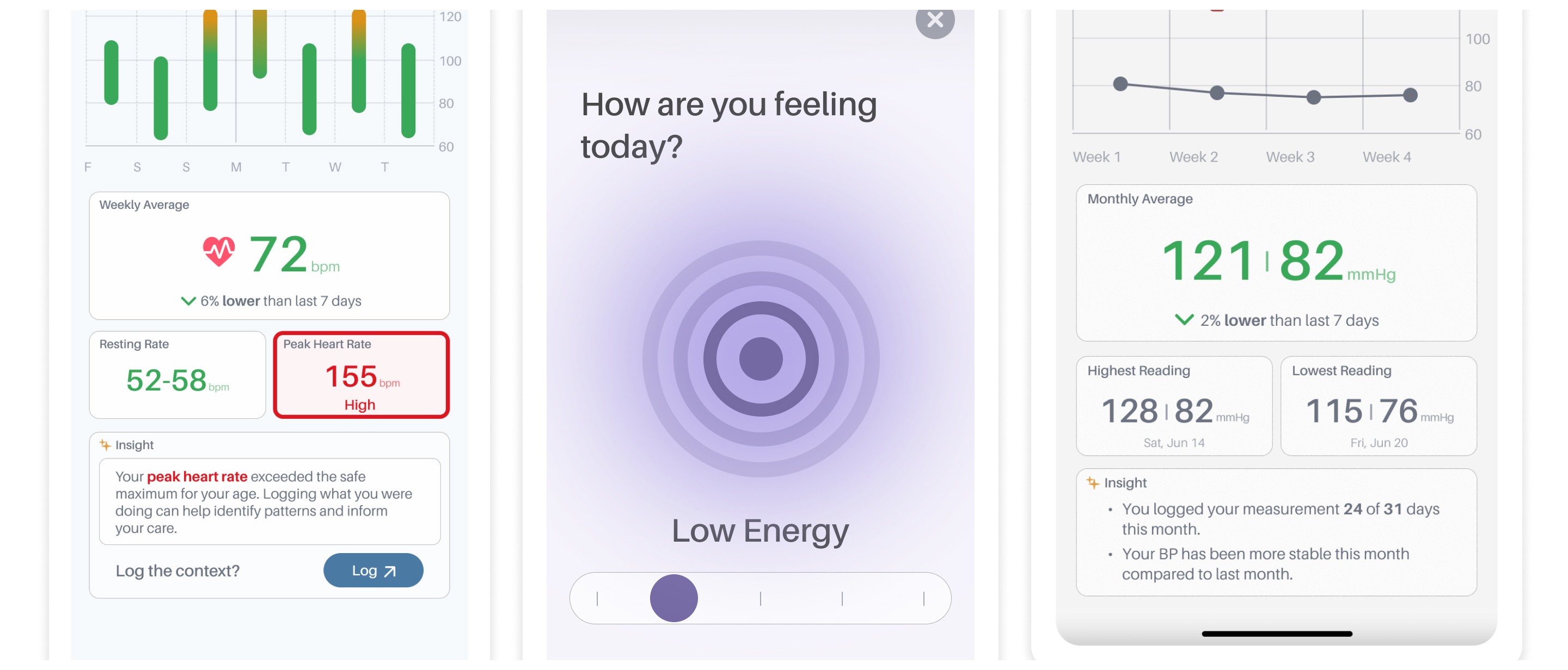
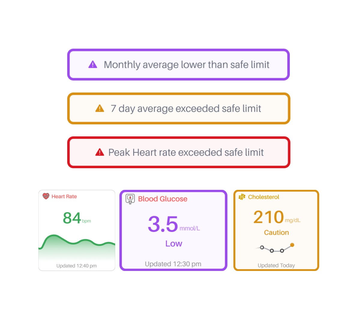
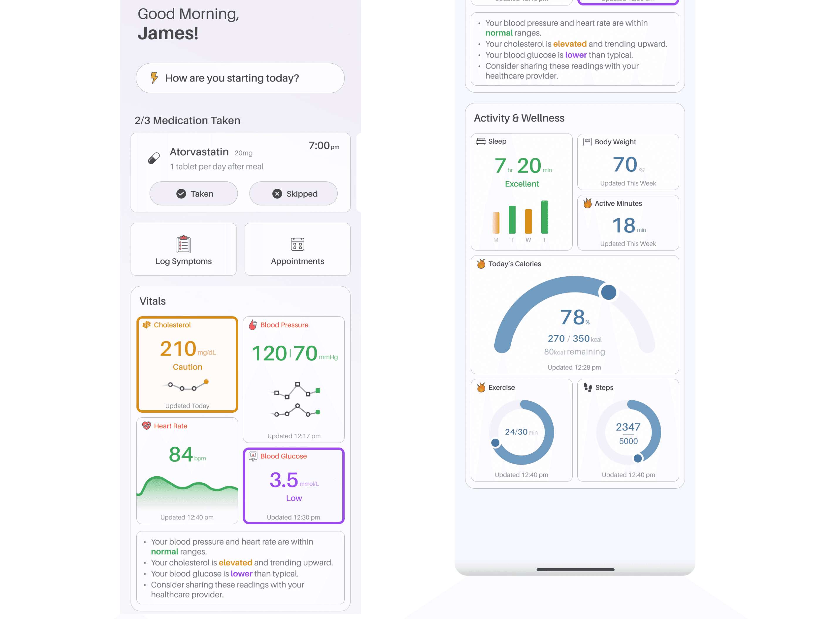
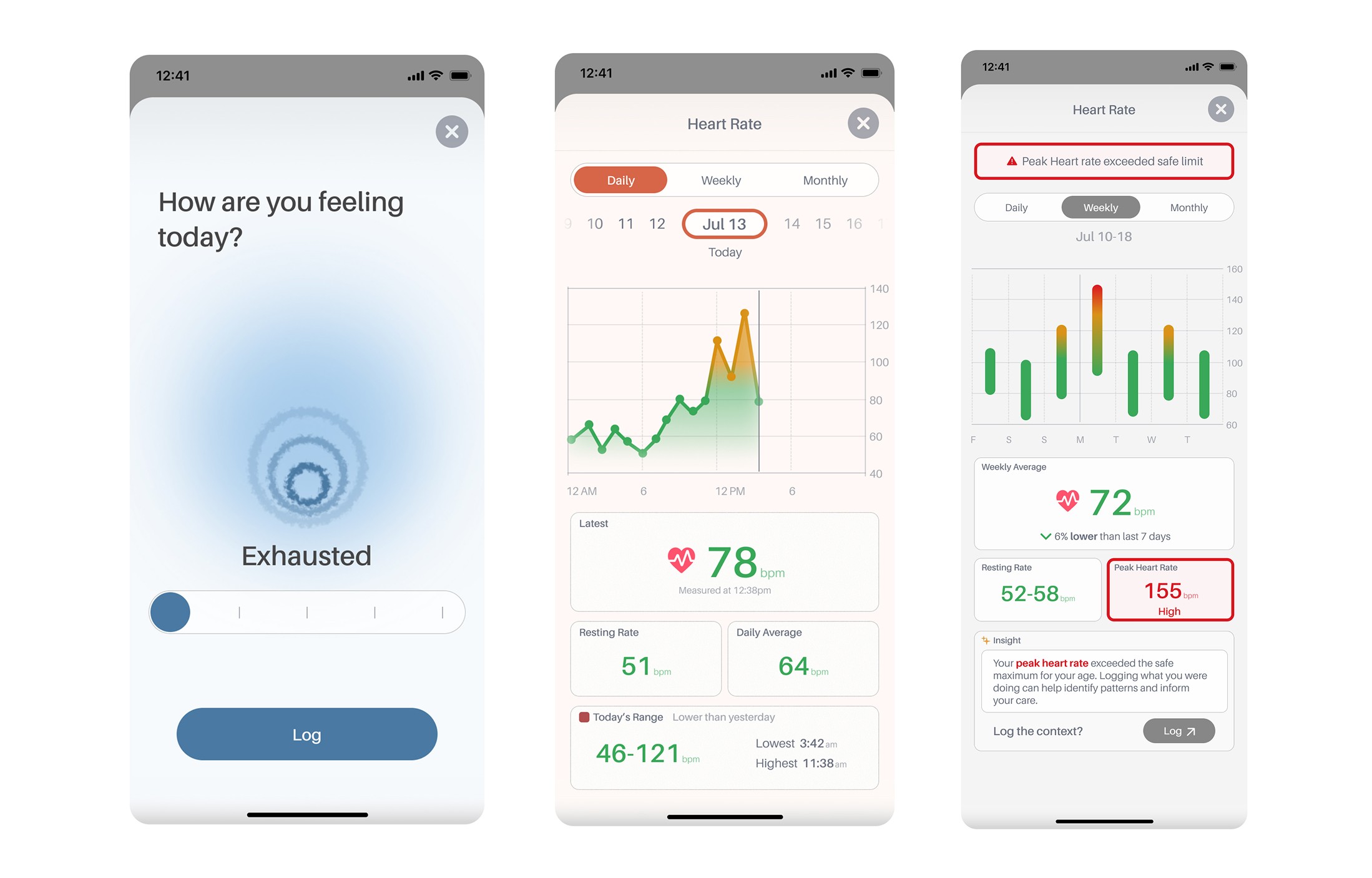
For the data itself, the goal was helping people understand when something actually needed medical attention. Instead of just showing a heart rate graph, the app explains what's happening: "Your peak heart rate occurred during a stressful period and exceeded safe limits." It tells people what the data means and what they should do about it. The alert system only shows status banners when something actually needs attention. Meaning no constant "everything's normal" noise. This helped patients understand when to monitor at home versus when to contact their doctor, which ended up reducing unnecessary clinic visits at the pilot sites.
Results
The result is a system that adapts to how someone's feeling (which is also critical to cardiovascular health) while keeping the clinical information clear and actionable, both for patients managing their health day-to-day and for clinical staff triaging cases remotely.
Design Principles
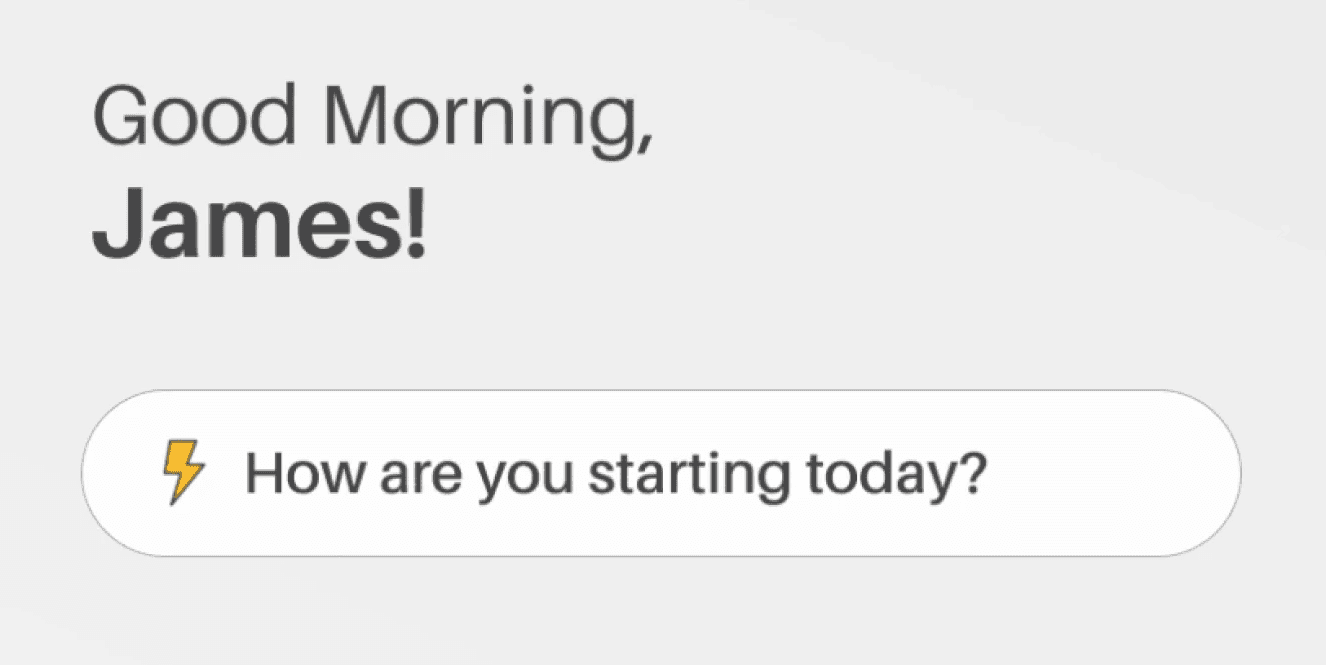
Adapting the Interface to Daily Energy Levels
Most health apps treat monitoring like a checklist. They show you your heart rate or blood pressure, maybe add a green checkmark if it's "normal," and that's it. But for someone managing a chronic condition, that's not enough. What does 128/82 mean in the context of your stress levels today? Should you call your doctor about that spike, or is it fine to just keep an eye on it?

Surfacing Alerts Only When Needed
Status banners only appear when metrics are outside normal ranges. Instead of cluttering every screen with "Normal" labels, the app stays quiet when things are fine and only speaks up when there's something worth paying attention to. This reduces alert fatigue and makes important warnings easier to spot.
Translating Data Into Insights
Every piece of data comes with an explanation. Instead of the the app showing that your heart rate spiked, it tells you it happened during a stressful period, explains why that matters, and suggests whether you should monitor it or talk to your doctor. It's about translating medical data into language that makes sense without a medical degree.

Visualizing Clinical Risk Through Colour
For visualizations like the weekly heart rate view, I used gradient-based colour coding that maps to actual clinical thresholds. Green bars represent normal ranges, orange shows elevated levels, and red indicates concerning spikes. The colours are tied to medical significance, so users can scan the graph and immediately understand which days were fine and which weren’t.

Final Designs


Password: SamS.Design